CS·2 Case study — iHeartMedia B2B
Converging on a landing page, in the open
A B2B advertising landing page explored as multiple working directions — an iteration series, two full pre-production options, and the decisions that cut them down to one shipped page.
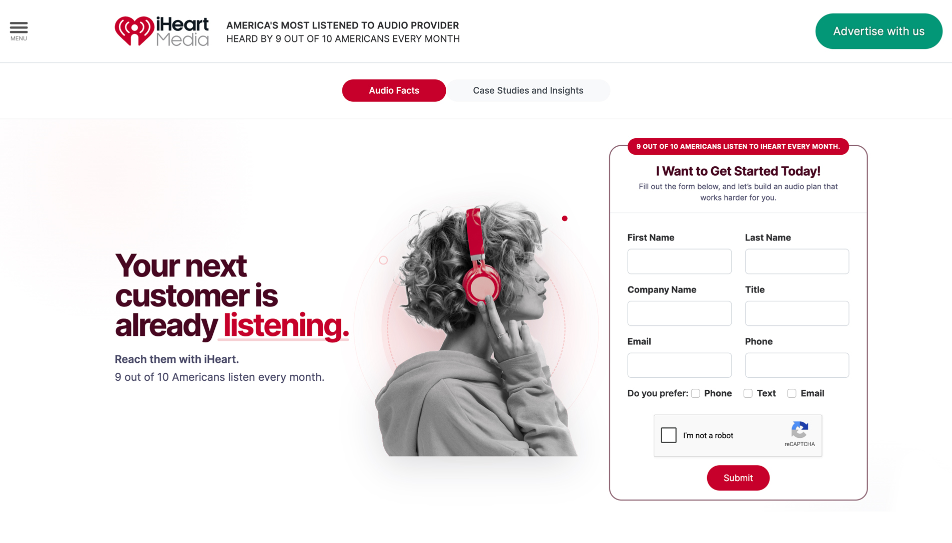
01 The brief
Sell advertising to advertisers
iHeartMedia's B2B marketing needed a landing page to increase lead generation with an evergreen approach — not a one-off campaign push, but a durable advertise-with-us destination that keeps converting. It was aimed at media buyers and brand marketers, and reached across both small businesses and national brands.
B2B pages fail in a predictable way: they say everything and convert no one. The brief was as much about deciding what to leave out as what to show.
02 The exploration
Directions explored as working pages
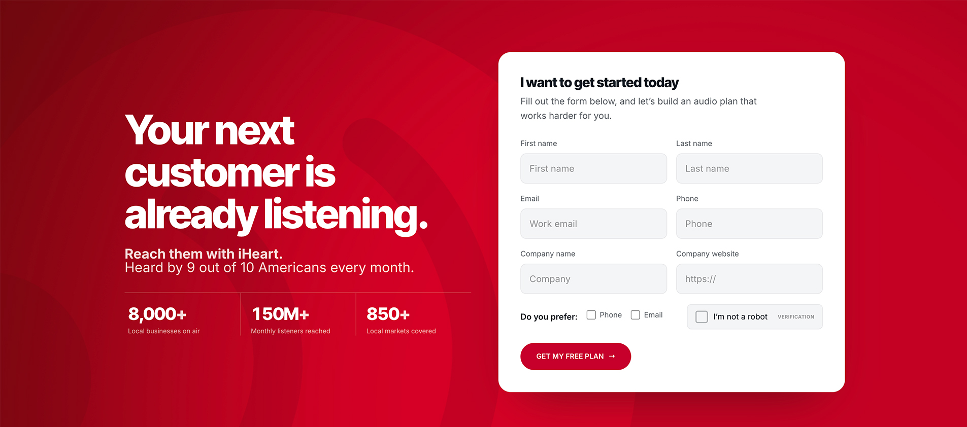
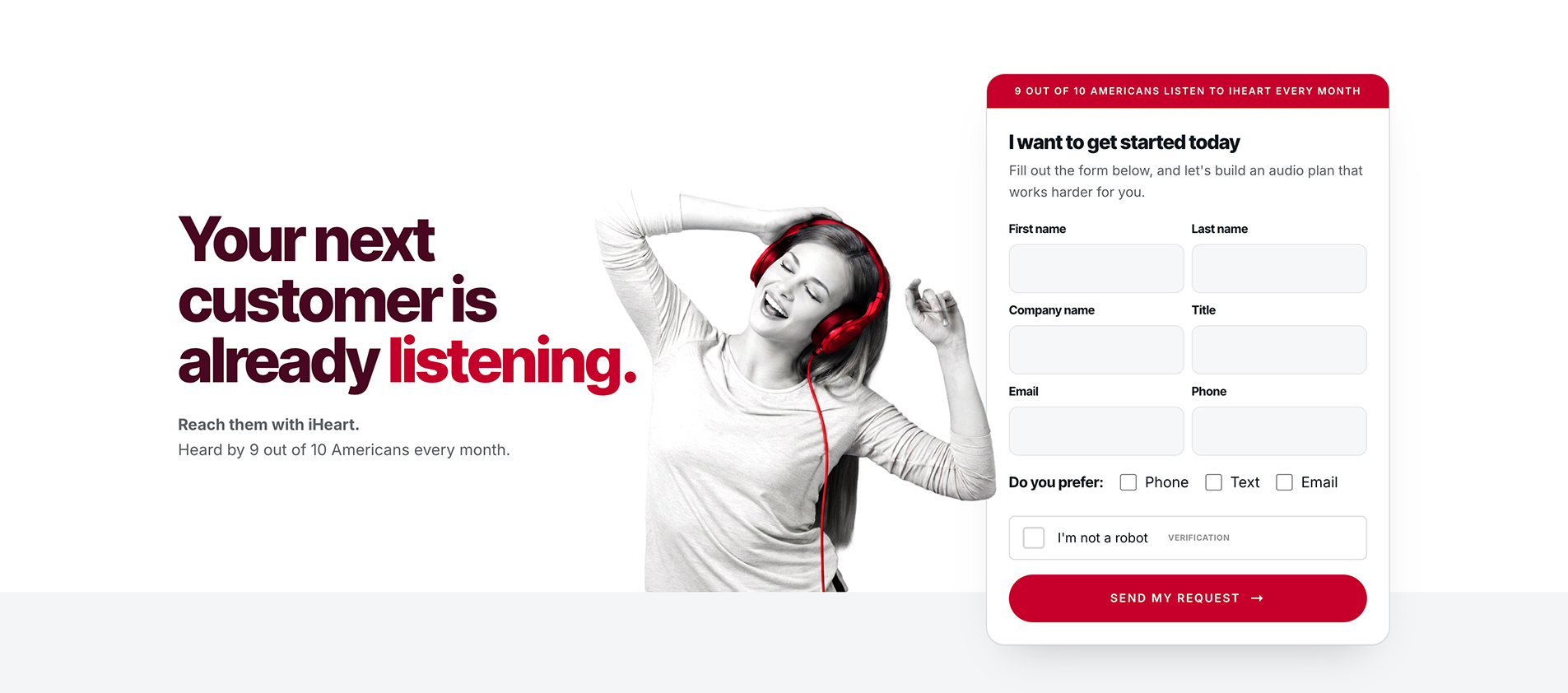
Instead of static comps, the exploration ran as an iteration series of working pages — the mock4 line, evolving through mock4_5 — with dark and light theme variants, scroll-triggered animation patterns, and real content throughout. Two directions matured into full pre-production candidates: Option A and Option B, built as split files with inline preview exports so stakeholders reviewed the real thing, not a picture of it.
Decision
Explore in the medium. A direction you can scroll, resize, and feel beats a direction you can only look at — and it makes the eventual choice honest.
03 The convergence
Cutting to one
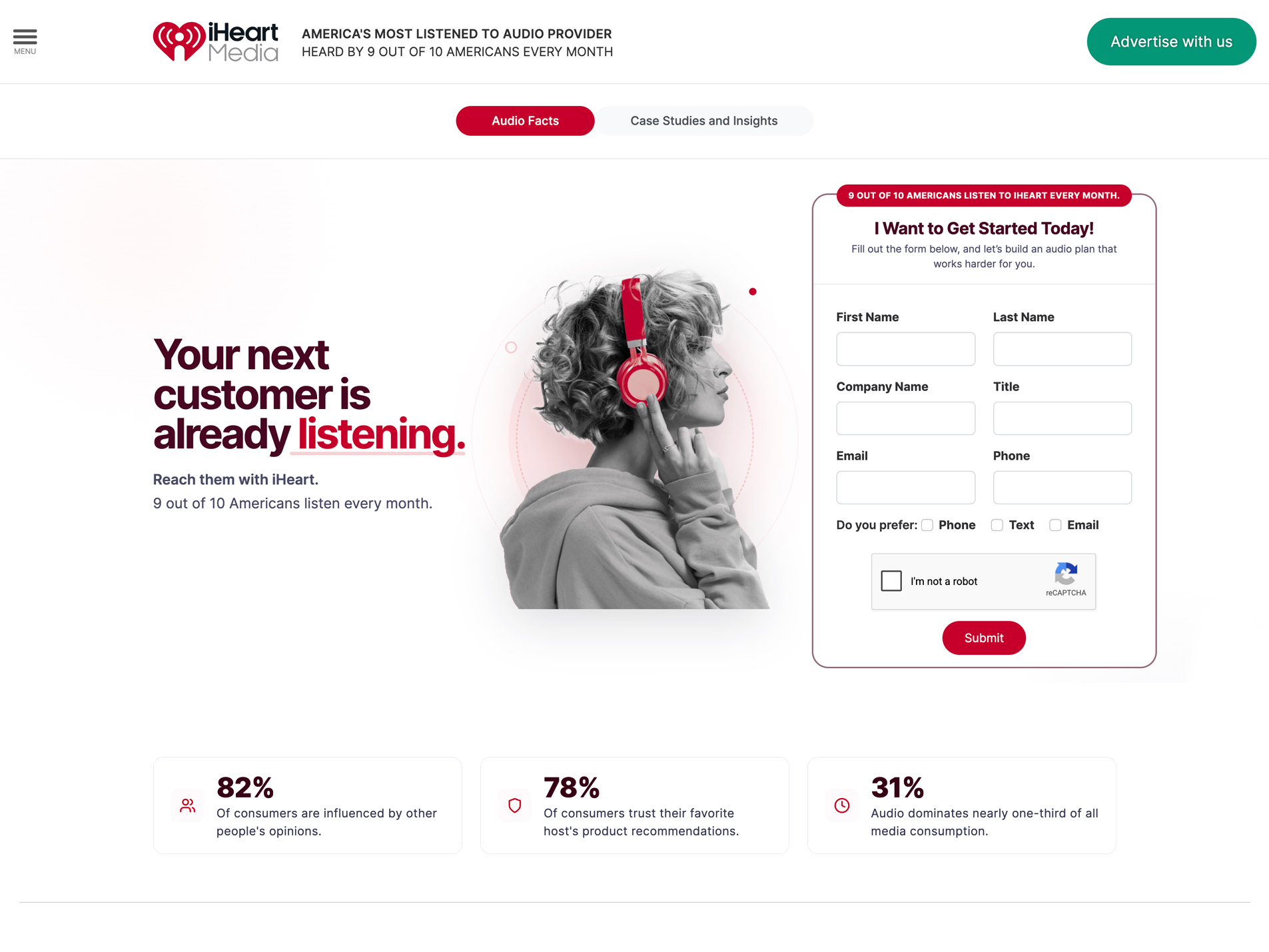
The shipped page was a blend — the strongest elements of both explored directions, pulled into one. Stakeholder input drove which pieces carried forward: the options existed precisely so the team could react to something real, and their feedback is what resolved the blend rather than a single designer's preference.
What got cut mattered as much. Some features were dropped for the same reason the blend came together — stakeholder direction narrowed the page to what served the evergreen lead-gen goal, and anything that didn't earn its place came out. Killing work you like, for reasons you can articulate, is the job.
04 The outcome
What happened after launch
The evergreen approach meant the page was built to keep working long after launch rather than spike and fade — a durable lead source, not a campaign that peaks and goes quiet.